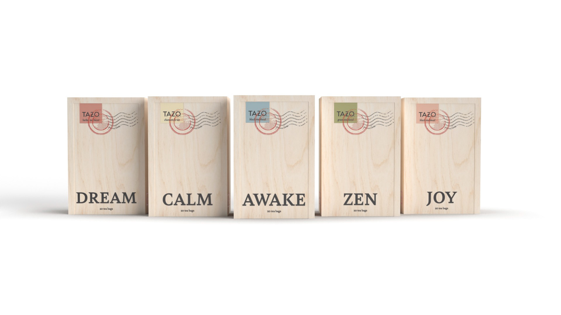
For this project, I was tasked with re-designing Tazo Tea’s packaging. The concept for this packaging was inspired heavily by the wooden crates tea was shipped in during the 18th-19th century. This is seen in the use of the wooden sliding box, the use of stamped information on the sides of each box, and the shipping seal on the front of the packaging. The type choice of Bely Bold also reflects this idea, being a slab serif font, reminiscent of signage/legal documents of the time. With all of this, I wanted the consumer to be reminded of this history and have a feeling that this tea has traveled the world just for them.